Greetings, A to Z Bloggers.
Our graphics person, Anjela, has retired from the team. We thank her for her time and the beautiful 2022 logo.
The team is working on more year-round content to help you blog better and faster, grow the community, and be more connected.
Our "target audience" is, and always has been, bloggers of all ages in all genres worldwide.
We hope to inspire our fellow bloggers to keep blogging regularly and "hopping" to each other's blogs all year. 💻🐇
We hope to bring you more content, insights from the team, and chances to share your own blogging tips with the community. We're here for you year-round, not just in April. We're going to explore ways to expand your blogging audience.
AND WE'RE GIVING YOU A SECOND CHALLENGE!
That's right. You asked for it; you got it. This September and October will have a low-key reverse alphabet challenge. Details coming soon.
What about the regular April A to Z Challenge?
No significant changes. The banners, badges, forms, and sheets will remain. There will still be a Theme Reveal hop, the normal April A to Z Challenge bloghop, and the Road Trip. It's okay if you only want to visit us in March, April, and May for those events. We're just stepping the site up to give you more during the rest of the year.
What's next for the A to Z Team?
We are diligently working behind the scenes to create inspiring blog posts.
Please don't forget that the Road Trip is still going on. We're planning to throw more support to those who signed up! https://tinyurl.com/AZtrip22
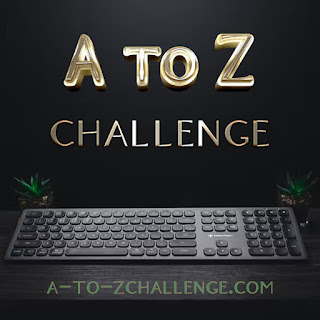
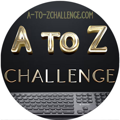
We're getting someone else to do graphics. What do you think of the look of this offering?


Square, Round, Social Media, Favicon
- Are you interested in more posts and content from the A to Z Team?
- Would you be interested in contributing a post?
- Are you excited about a second challenge?
- What are your thoughts on this possible graphic set for the A to Z Challenge?

Love the idea of more challenges! Love the logo. The square one is my favorite. Appreciate all you folks do for us!
ReplyDeleteJanet’s Smiles
Like the idea of more challenges - I always blog more in April than most months! I think the square logo is better - shows all of the keyboard. You're a great team. Thanks for all your efforts.
ReplyDelete